

Hey! Ich bin Patrick, Webdesign-Lehrling aus Tirol. Ich erstelle moderne, professionelle Websites für Unternehmen und liebe es, mit neuen Technologien zu experimentieren.
Seit September 2024 bin ich in der Ausbildung und arbeite nebenbei an eigenen Projekten und ersten Kundenprojekten – von der Planung bis zum Launch.
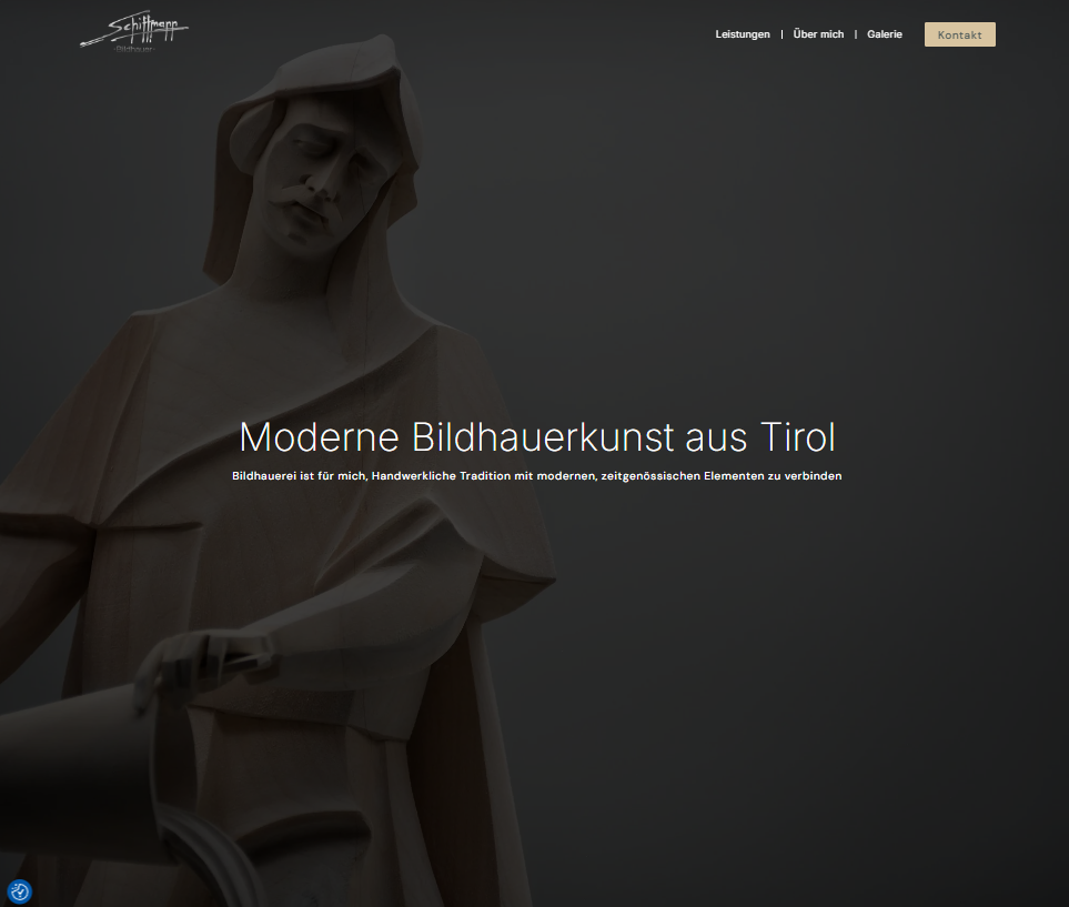
Professionelle Website für Josef Schiffmann – modern, schnell und individuell gestaltet.
Seite besuchen →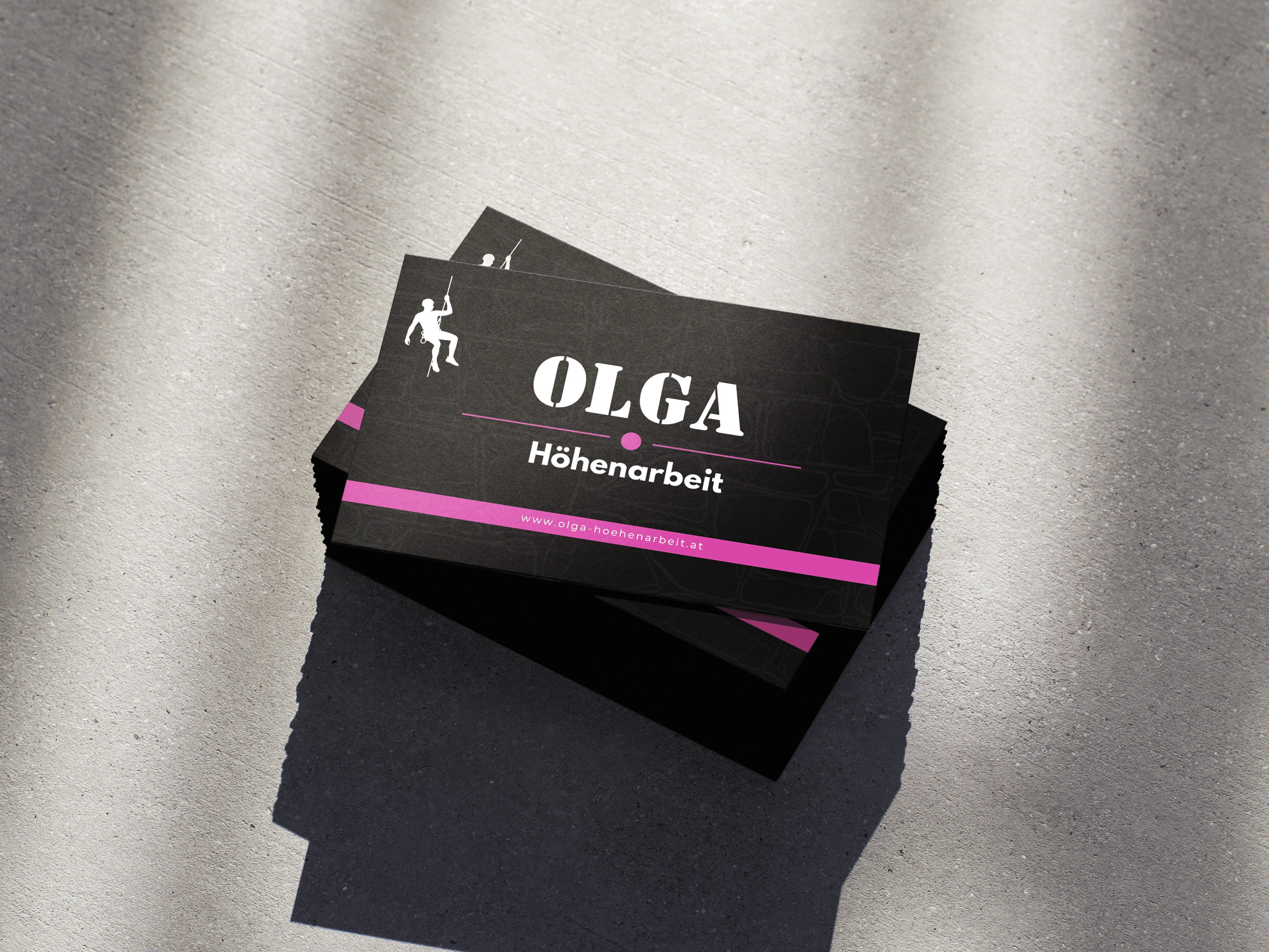
Visitenkarten-Design für Olga OG – klares Layout, starke Wirkung, bleibender Eindruck.
Hast du ein Projekt im Kopf? Eine Idee, die noch auf ihre Website wartet? Ich freue mich auf deine Nachricht – egal ob es um eine neue Website, ein Logo oder einfach ein erstes Gespräch geht.
Ich melde mich so schnell wie möglich bei dir. Danke!